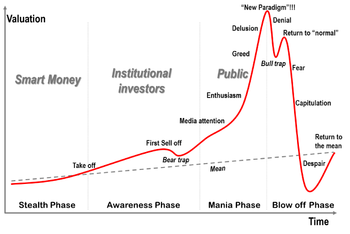
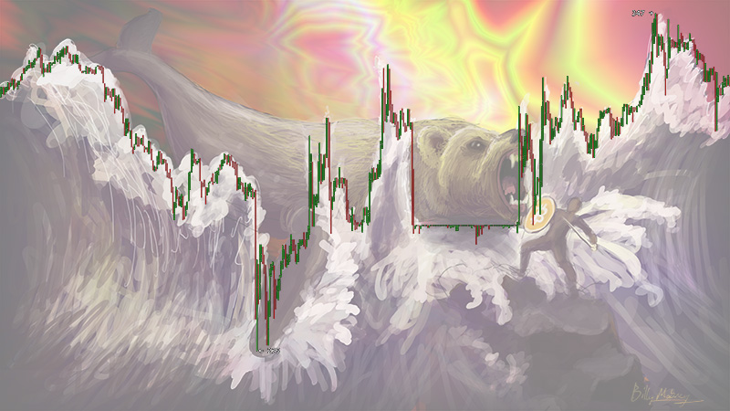
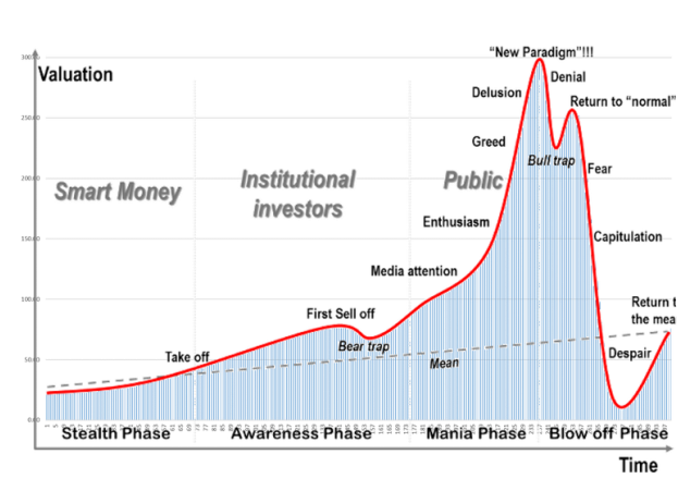
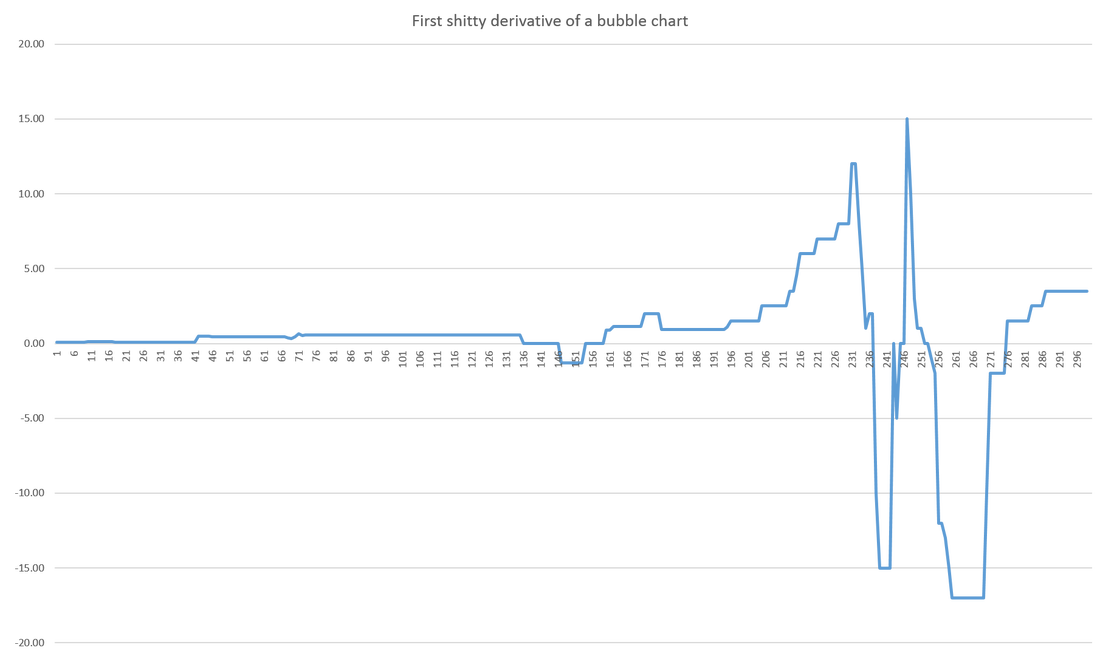
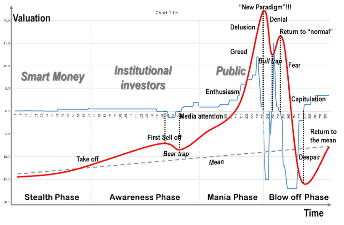
This isn't that interesting so stop reading now.Jean-Paul Rodrigue made this "Phases of a bubble" chart. See below. It describes the trend of a bubble. You know like the affectionately named "bubble" that keeps bursting repeatedly and destroying the economy? Mostly the housing bubble. Bit coin almost faced the same fate had it not been for the bear whale. See below. A trend began to appear to the left of the bear's ear as pictured above. The same trend that spells demise for a bubble. So this anonymous user disrupted the whole thing in an effort to escape the tragedy of the "phases of the bubble." Good for him/her. My interest as an investor was to simply find the first derivative of the phases of the bubble chart. Half to know how to judge the market and half just for fun. I couldn't find it online anywhere so I just decided to do it the old school way. Like how maybe Newton invented Calculus in the way. Just by hand - and excel. So first I did a rudimentary bar chart to find the values of the picture. (remember this is how calculus was discovered back in the day. Don't give me crap. I later discovered a way to convert the x,y values of the mouse into csv so I could have traced the goddamned thing. But again this was just for fun.) So I made this. See below. I overlay-ed the image onto a bar chart with the values determined from an excel column. Then I undertook the ridiculous task of determining each value one-by-one by changing the value in the cell until it fit the picture. (I dig grab and drag, but still I felt like a true Newtonian at heart). Then I made a column that calculated the difference between each new value against the previous one. It had serious errors, so I sort of tried to mitigate that by editing it. Then I came up with the final graph of the first derivative. Which looks like total shit so sorry for reading all of this. My methods weren't accurate enough to produce really anything significant. Maybe if someone ever reads this they can improve on my method. I really just kind of want to see what the first derivative of the bubble chart would look like. I could use some help on my methods so anything is appreciated. Thanks for reading. Enjoy this shitty final result below. and combined and kinda fitted. Thanks for reading. Any feedback is appreciated! I did this just for fun. As math should be :)
2 Comments
Anonymous
12/16/2014 01:05:18 pm
What I would do is import the image in Javascript/canvas, and then scan it from left to right with a for loop. For each x-coordinate, find all the pixels in that column whose color is red-ish, and take the average y-coordinate of those.
Reply
1/17/2020 02:44:03 am
This was an interesting read for me, that is for sure. I did not really used to go and read blogs like this, but you completely changed my opinions of them. I think that this is the best thing for me to read at the moment. I understand that it is not as easy to read as what I used to read, but it was good. I was able to go and enjoy it because it was a breath of new air.
Reply
Leave a Reply. |
AuthorI am just a man trying to be part of mankind. I am also trying to be more than just a man. Archives
February 2015
Categories |
 RSS Feed